The New Neutrals: Wedding Editorial
A day of creative collaboration before COVID-19 sent us indoors
Photography: Seneca Ryan Co
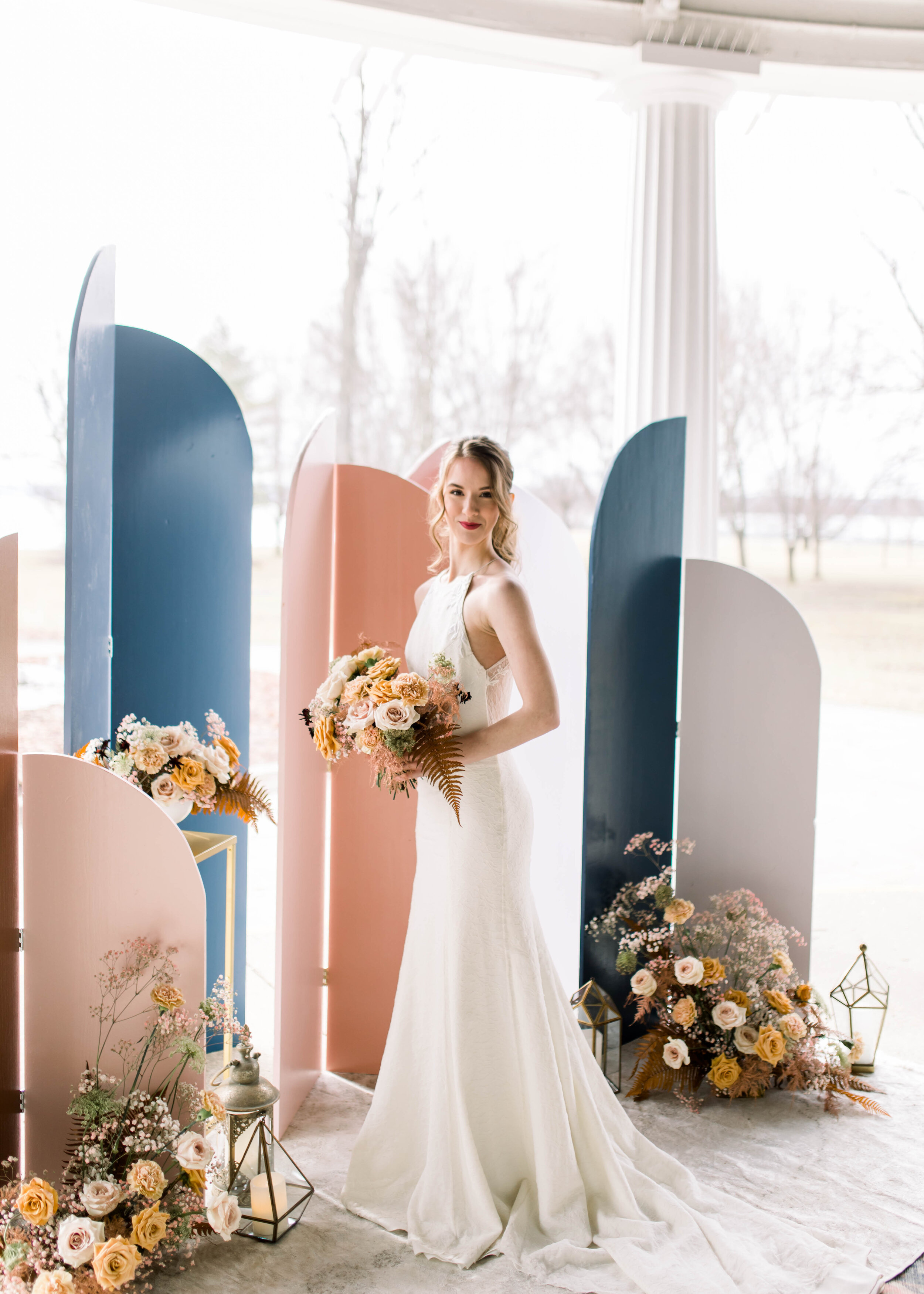
Beige on beige is no longer the definition of neutral, I say! Sorry, Frasier. Navy can be an anchor for almost any design. It goes with everything. (Even with black? Yes! Am I being scandalous?) Blush has grown up to dusty pink and made friends with milky coffee, caramel, and sandy hues. What do you think? Can we call this palette neutral? Maybe, maybe not, because I definitely think it has an opinion. Whatever we call it, it was the perfect backdrop for a marriage of vintage and modern details.
The invitation took on a curvaceous silhouette to set the tone for this modern editorial featuring a fresh ceremony backdrop by She Rents Vintage and her vintage lounge pieces in soft blues, dusty lilac, shades of blush, nude, and rust.
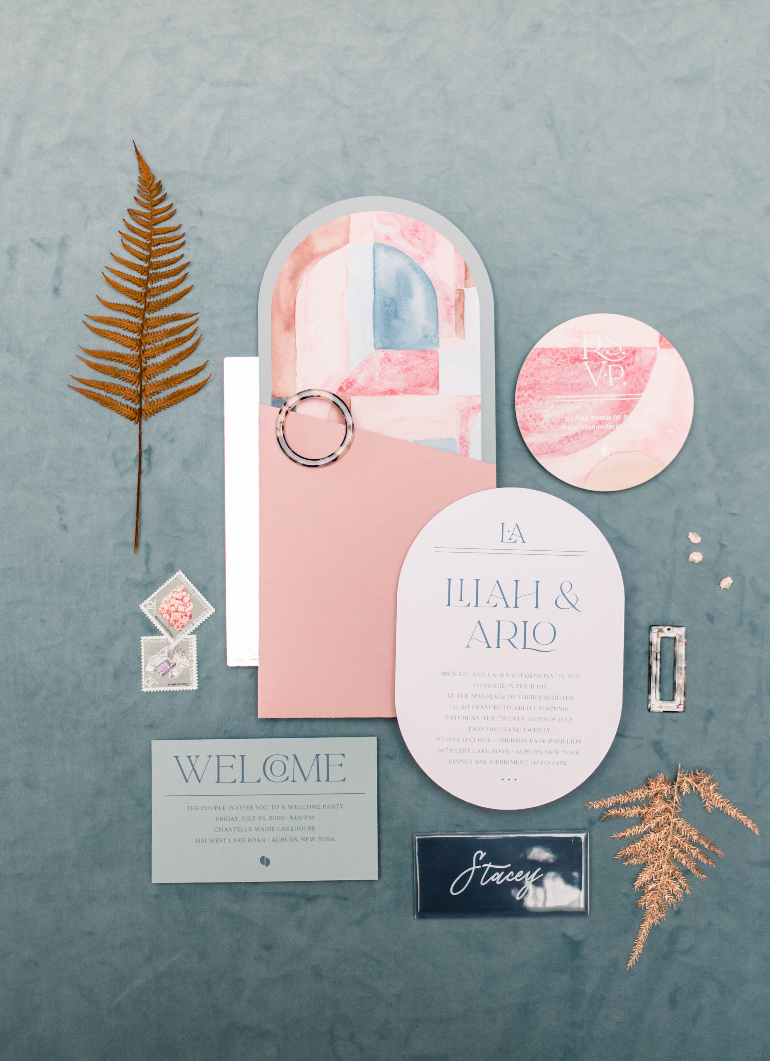
To translate this palette into paper goods, I created a custom envelope from two die-cut pieces of dusty blue and dusty pink papers and finished them with vellum address wraps and vintage stamps. The curved flap opens on the short of the envelope side to reveal a geometric watercolor liner.
Photography: Seneca Ryan Co
Rectangles are good, but this invitation shows off a mixture of curves and right angles.
Photography: Seneca Ryan Co
Silk ribbon, vellum, and some faux tortoise shell accents make the invitation a tactile treat. I wish you could reach into the photo and touch all the textures here: velvet fabric from She Rents Vintage’s new old sofa, copper ferns from Cedar and Sweetpea , glossy tiles calligraphed by Paper Crane Calligraphy.
Looking toward the future:
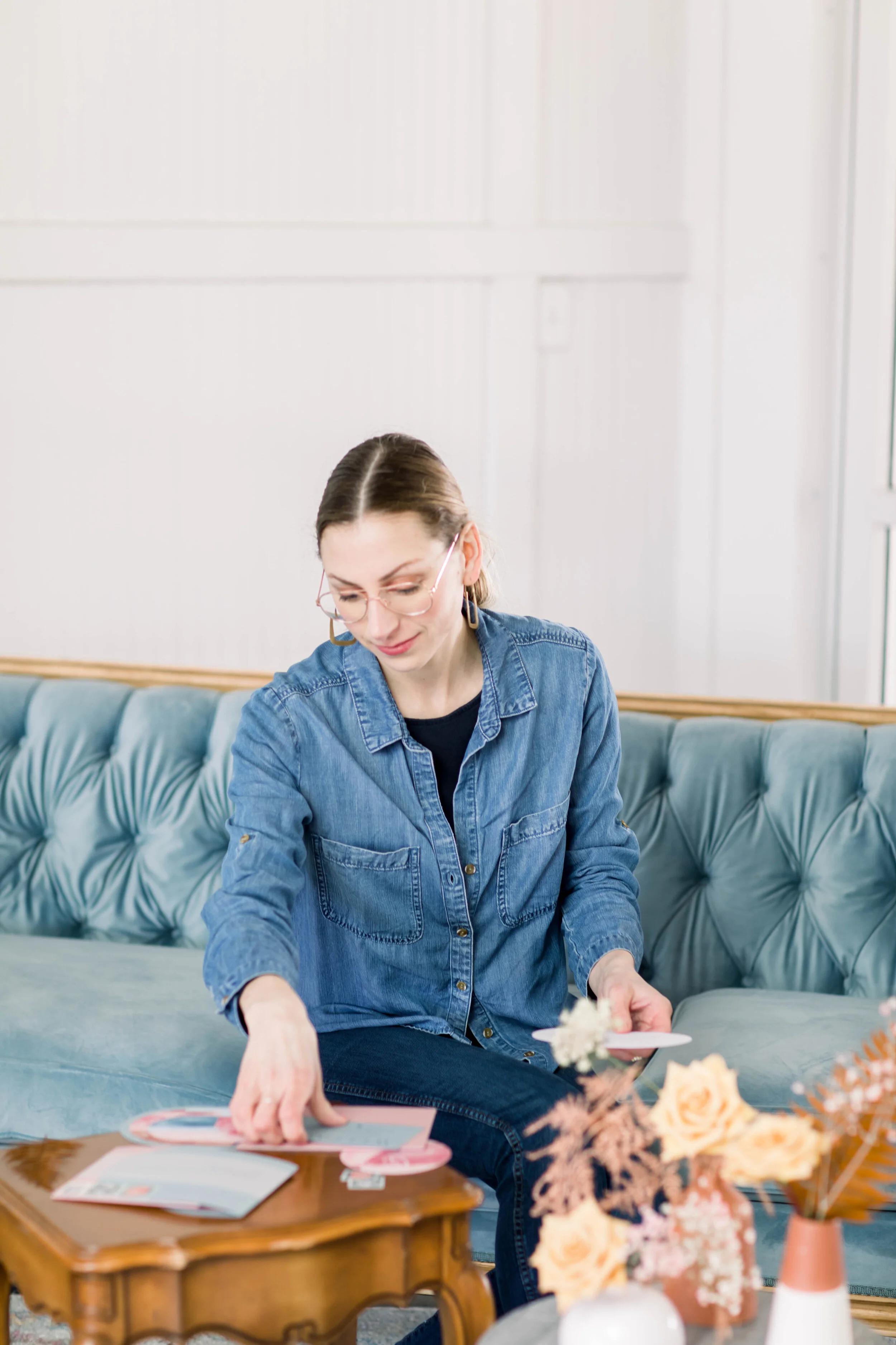
I write this in the time of the COVID-19 crisis, when many couples are struggling with contingency plans, postponements, and so much strife over the unknown. We’re inside for now and many things are on pause, but we can keep dreaming and planning for the future. This shoot happened just days before the big grocery store stock-up that kicked off weeks (so far) of staying home. I met several women I hadn’t yet worked with and I’m grateful for that late winter day of sharing a space and exchanging ideas with other creative wedding vendors. Everyone showed up with their best work and I can only imagine that the time we’re all inside dreaming and practicing and working solo will result in explosion of creativity and beautiful new design when we can all come out and meet again.
Vendor Team
Venue: Emerson Park
Rentals & Styling: She Rents Vintage
Invitation Suite: Stone Fruit
Photography: Seneca Ryan Co
Calligraphy, Escort Cards: Paper Crane Calligraphy
Florist: Cedar and Sweetpea
Hair: 315 Beauty Bar
Makeup: Annie Ross
Dress: Gee June Bridal
Tables/Chairs: Auburn Party Rental
Jewelry: Imagine Skaneateles
Cake: The Cake Shop CNY


